Game asset maker
You need a small environmental icon, prop, or character reference that reads quickly in a compact interface.
Check the silhouette at thumbnail size, then confirm that the key feature is not hidden inside the background.
Focused conversion
With image to pixel art 32x32 conversion, a detailed picture becomes a compact grid of deliberate blocks. Use the comparison steps below to keep the subject readable at a small scale.

Set expectations
A 32×32 result has only 1,024 cells, so every edge, color group, and empty area matters more than it does in the source image.
Hair, fabric weave, grass, clouds, and tiny lettering may collapse into indistinct clusters when reduced to 32×32.
What to do instead
Choose a source with a clear subject and simplify the most important texture into larger shapes.
A distant person, object, or animal can become too few blocks to identify after reduction.
What to do instead
Crop closer before conversion or use a pose and silhouette that remain recognizable at thumbnail size.
Near-identical shades may become one visual mass, especially in shadows, skin tones, skies, and low-contrast backgrounds.
What to do instead
Prioritize contrast between the subject and its surroundings instead of preserving every original shade.
A 32×32 grid cannot reliably retain normal words, fine symbols, or detailed logos from a larger image.
What to do instead
Remove the lettering or redesign it as a few bold marks after reviewing the reduced version.
Conversion workflow
The useful question is not whether every pixel survives, but whether the image keeps its subject, pose, silhouette, and visual hierarchy.
Start with one clear subject, a readable outline, and enough separation from the background. A busy wide shot usually needs cropping before reduction.
The source is interpreted as a compact 32×32 arrangement. Large forms remain influential, while thin lines and subtle transitions are compressed or removed.
Compare the small result with the source and decide whether the intended subject still reads first. If not, simplify the background or strengthen the main silhouette.
Related paths
Tool preview
Use the conversion prompt to hand off a specific subject and style, then compare the compact result against the source rather than judging it at full-image scale.

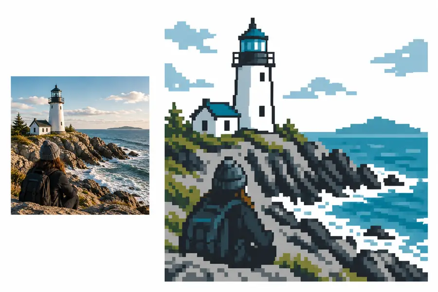
Judge the silhouette before the detail.
Source image32×32-style resultPractical checks
Different people notice different failures first. These checks help confirm that the reduced image still serves its intended use.
You need a small environmental icon, prop, or character reference that reads quickly in a compact interface.
Check the silhouette at thumbnail size, then confirm that the key feature is not hidden inside the background.
You are using the result as a visual guide for a square-based craft or repeating design.
Count the major color regions and look for isolated single cells that may be awkward to reproduce consistently.
You want a simple reference for planning a block-built scene, emblem, or landscape.
Verify that the largest planes and color bands remain distinct enough to translate into placed blocks.
You are studying how a detailed picture becomes a small arrangement of intentional squares.
Compare the source, the reduced image, and the subject’s outline to see which visual information carries the meaning.
A strong 32×32 result starts with a strong visual decision: one subject, a useful crop, and enough contrast to survive reduction. Use the tool handoff when you are ready to test a source, then inspect the result at its intended display size. If the subject reads immediately, the conversion has preserved what matters.
Common questions
It means reducing an image into a compact arrangement of 32 columns by 32 rows. The result has 1,024 grid cells, so broad shapes and strong contrast matter more than fine photographic detail.
No. It works best for subjects with a clear outline, a focused crop, and meaningful contrast. Detailed group photos, distant subjects, and images with lots of tiny text may need editing before conversion.
A fixed small grid cannot preserve every texture, gradient, or thin line. It combines nearby visual information, so the result keeps the strongest forms while discarding details that cannot fit clearly.
Use a closer crop, simplify the background, and make the subject stand apart through shape or contrast. Review it at a small display size instead of relying only on a zoomed-in view.
It can be a useful visual starting point when the design has clear square-based regions. Check the color groups and isolated cells carefully, then adapt the pattern to the materials or blocks you plan to use.